ComBoard
EmailEmail LidiaLidia's Resume Lidia's Resume Resume
Download 1 Pager

ComBoard Intro

Overview

Empathy & Research

Problem Definition & Success Metrics

Design Process

Sticker Sheet

Learnings & Next Steps

Improving & Furthering Project

ComBoard: Design an "eye tracking" keyboard app that minimizes CB student's strain while spelling.

(05/2024 - 10/2024)

Lead UX Research & Design (solo)
Figma

Download 1 Pager
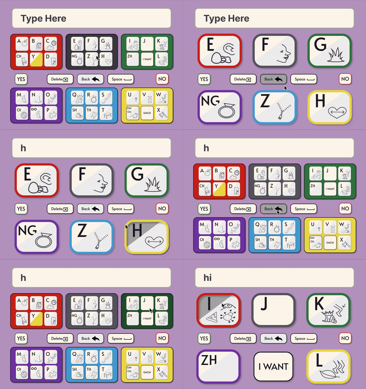
Gif showing the comboard being used to spell hi.
Desktop Design (click for prototype)
980% increase in use compared to prior tools from 2x/month (spring 2024) to 5x/week (spring 2025)

Overview

Problem:
Student's Tobii device induces strain due to small focus targets and reliance on fine motor control; additionally, both Tobiii and her plexiglass board are unwieldy, limiting her options for eye-based communication in most environments.

Goal:
Design a "pocket sized" digital replacement for the student's plexiglass communication board that limits strain.

Solution:
A responsive digital keyboard that can be easily personalized including preferred movements (Left-Right, Up-Down, etc.), preferred visual aids, preferred layout, and preferred focus targets sizes.

Note about constraints:
Work for this project was done part time, after work hours and on weekends.

Gif showing the comboard being used to spell hi on a mobile device.
Mobile Design

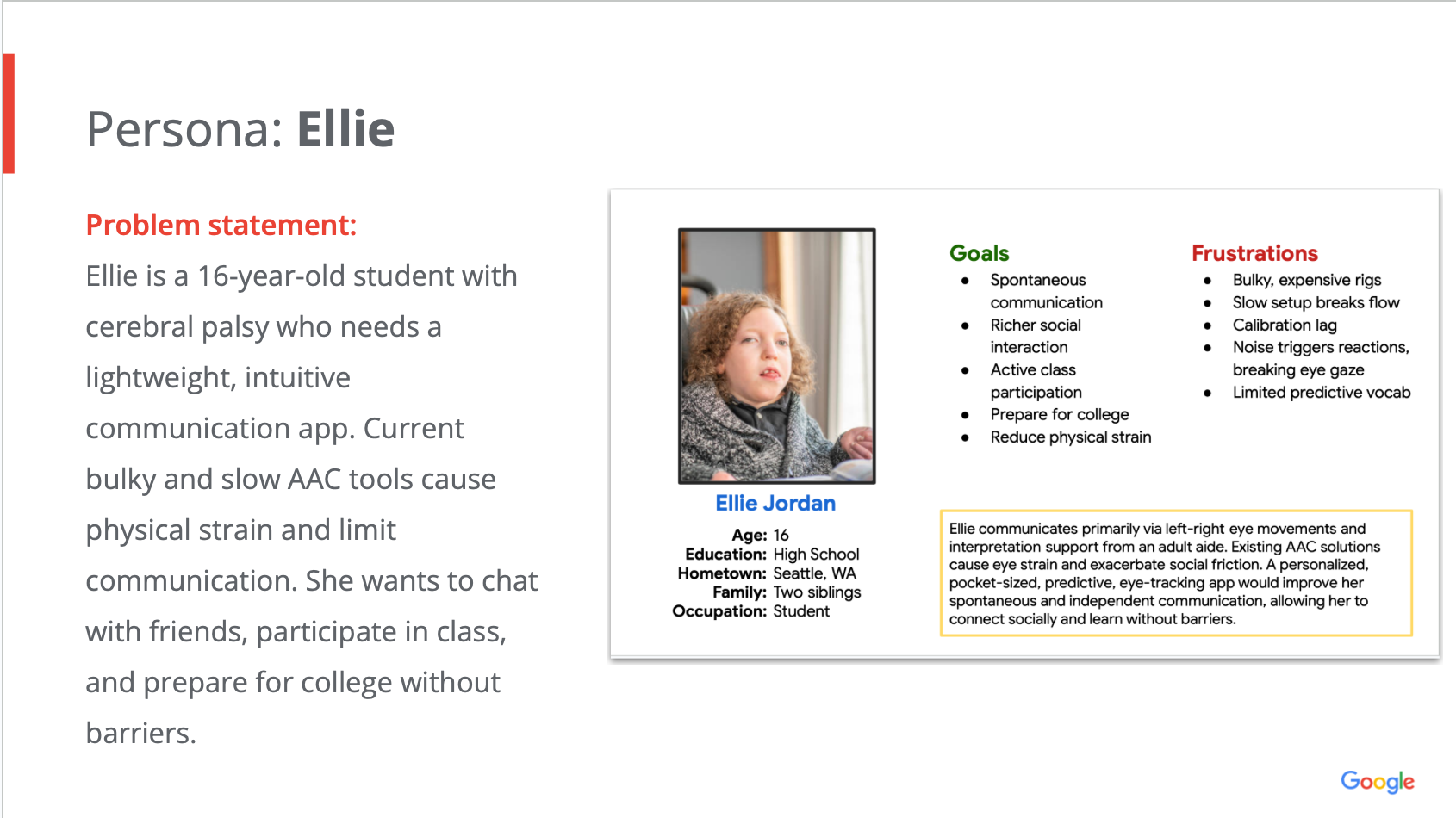
(This is a fictional persona based on a real individual)

A persona card introduces Ellie, a 16 year old student with cerebral palsy who needs a lightweight, intuitive communication app. The card shows her goals and frustrations.

Empathy & Research

Methods
Recurring user interviews
Competitive audit of AAC (augmentative and alternative communication) devices and tools

Key insights

1
Communication boards have limited word categories and lack spelling options for free expression.

Design decision:
Create a keyboard that integrates predictive text.
2
Many devices require fine motor control to select from many on-screen or on-page options.

Design decision:
Cluster letters to make selection more accessible to users with limited motor control.
3
Communication boards often have juvenile visual aids.

Design decision:
Custom design minimalist icons to aid in pairing letters to sounds.
4
Many devices are distracting and cluttered, creating strain for users with limited sustained gaze or heightened reactivity to environmental noises or movements.

Design decision:
Animate the interface to clear away distractions after each gaze selection.
5
Many devices and tools limit social interaction by blocking the user's face and view.

Design decision:
Create an app that anyone can download on any device so that the communication partner can hold the device instead of blocking the disabled individual's face.
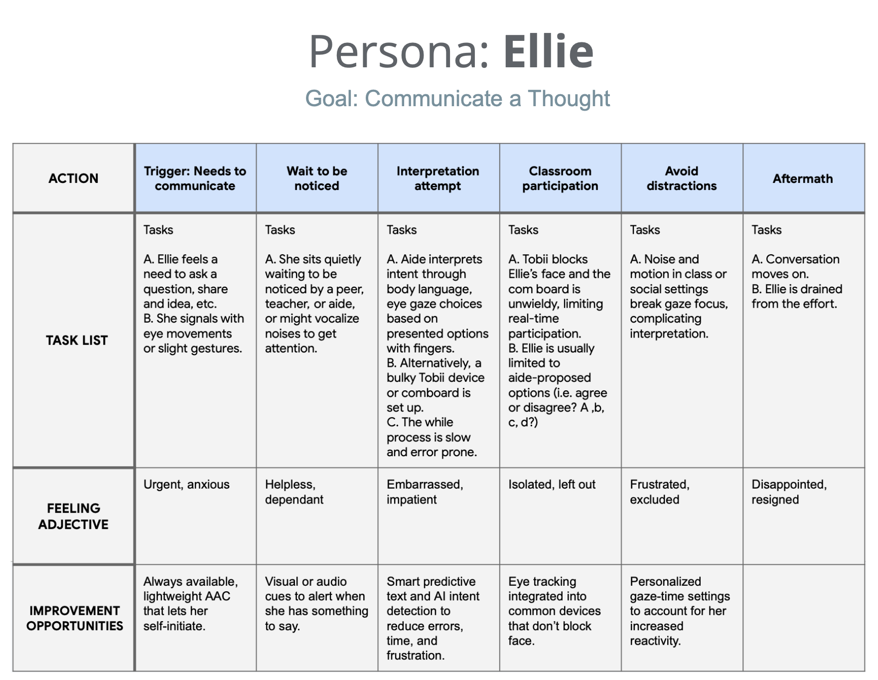
Journey MapEllie is frustrated and exhausted by current communication methods that further create distance between her and her aspirations. She wants to communicate independently and in real time.
A journey map showing the tasks ellie will have to undertake to communicate a thought using current tools and processes.

Problem Definition & Success Metrics

How might we…
design an AAC app that minimizes set-up and eye strain, integrates AI for predictive text and smart gaze tracking, and adapts to the unique needs of the individual so that they can communicate efficiently and independently without obscuring their face?

Quantitative Goal:
Double instances of spelling to communicate from 2x/month (spring 2024) to 4x/month (spring 2025)

Results:
980% increase in spelling instances using ComBoard 5x/week by spring 2025 on aide's phone and student's school tablet compared to 2x/month spelling instances when relying on heavy, bulky, plexiglass board.  

Qualitative Goal:
User preference rating at least 20% higher than other methods.

Results:
Method preferences were scored by the user Tobii (1/5), Plexiglass board (3/5),
ComBoard (5/5)

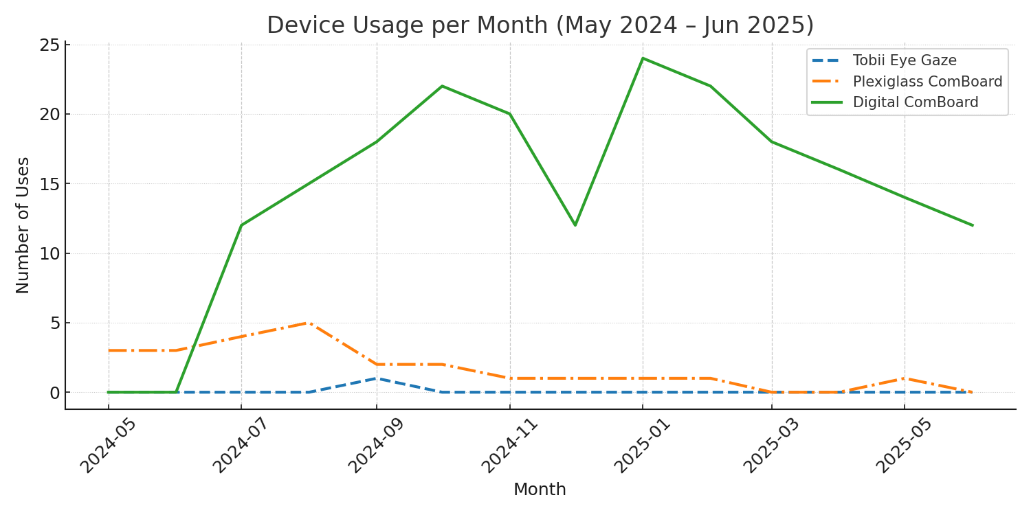
A line graph shows device usage per month from may 2024 to june 2025. The student requested to use tobii device the least and the line is nearly horizontal at zero, her plexiglass board occasionally, and the digital comboard most often and the line graph shows a peak of 24 uses in jan 2025. Plexiglass board usage decreased as digital board usage increased.  There is a dip in com board use during dec 2024.

Based on observational data. Mid-summer 2024, the student began consistently choosing to use the digital ComBoard over the plexiglass. Once school started, this became the exclusive choice for spelling tasks in school, but it is my understanding that the plexiglass solution was still used at home.

Design Process

Mobile App Design

Ideation & Drafting (Week 1)

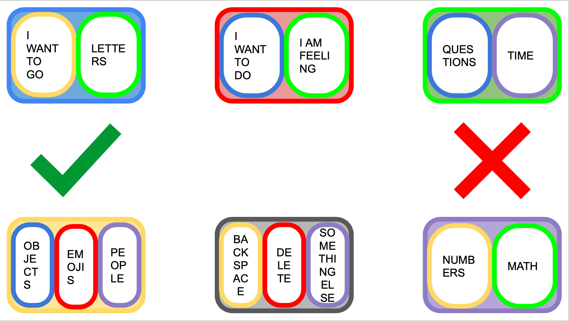
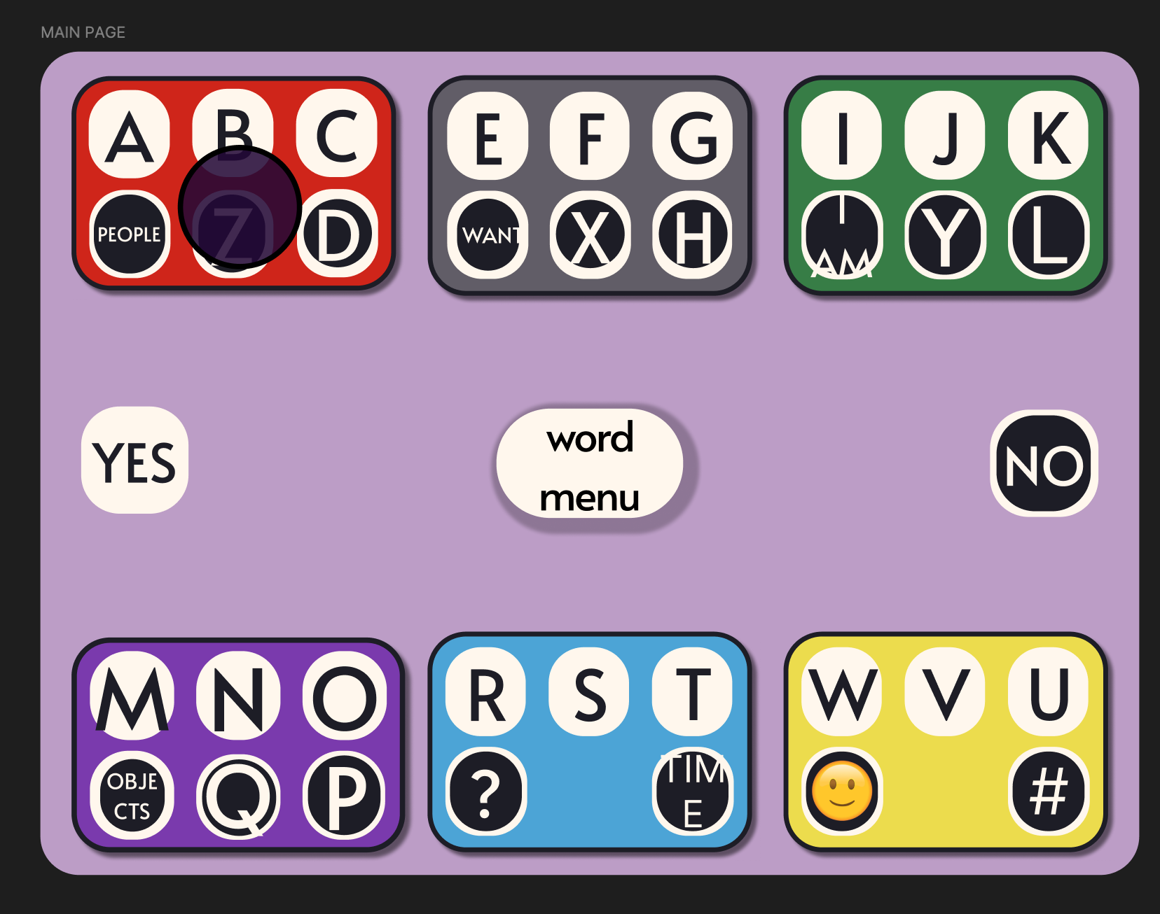
The first draft of the comboard designed on google slides. The background is white, the cards are outlines in bright colors, and the keys contain work categories instead of letters.An early iteration of the comboard designed in figma. The colors are much more muted and they keys contain letters instead of words. There are still some text formatting flaws.

My first approach was to make a communication board on google slides. My plan was for Ellie to communicate by using her eyes to select a category that their aide would then click. The slides would transition to the corresponding page and display more specific options for the user to choose. This is similar to the format of many current communication boards you might find online.

The limitations of this design became apparent very quickly, as I realized I would have to manually add each category and word option. This approach is not scalable and limits the vocabulary at the user's disposal regardless of their actual level of language development. The keyboard design puts more power back in the hands of the user.

Custom Designing Icons (Week 2)

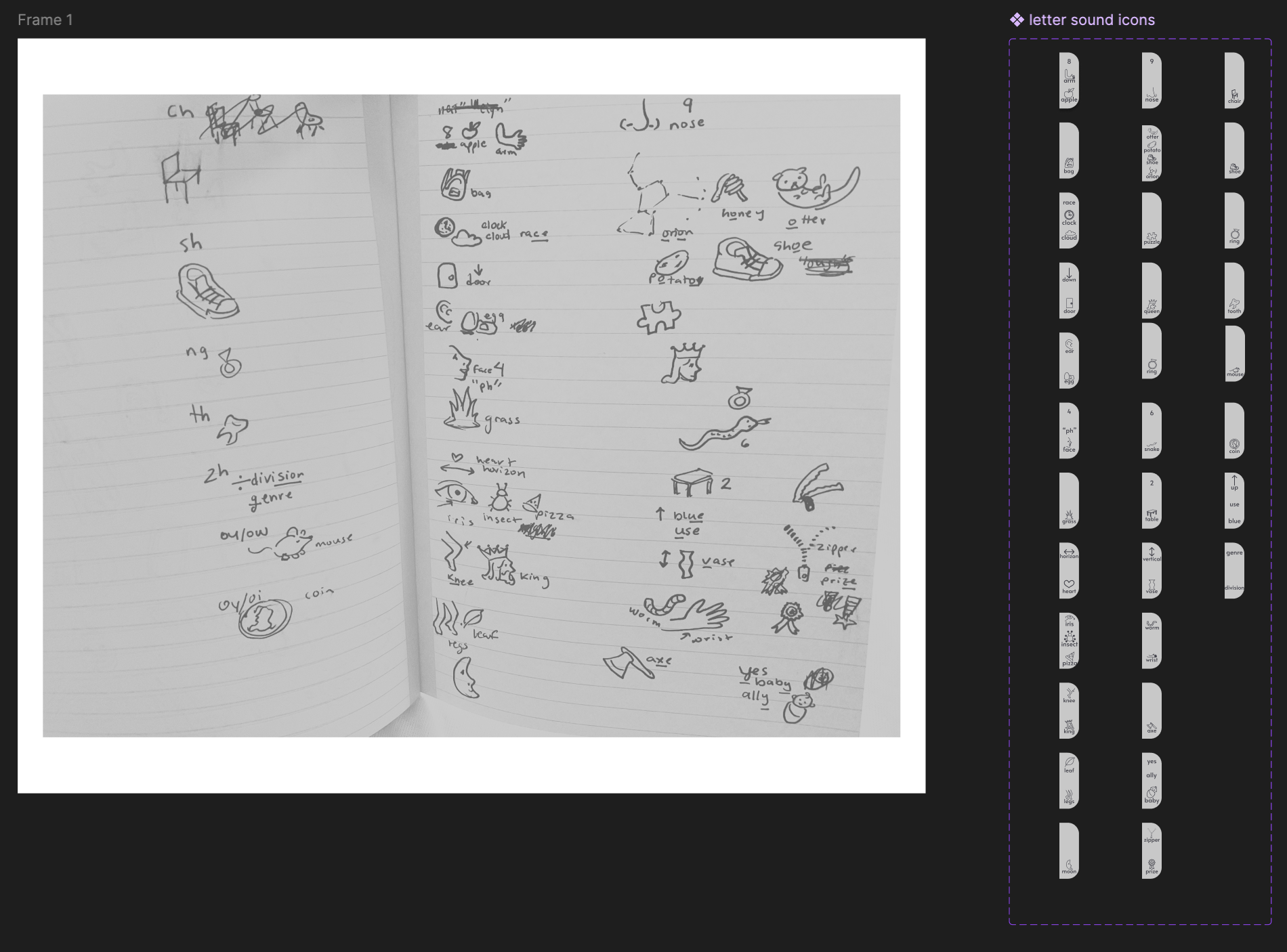
A page from the figma design file shows a picture of the original paper and pen sketches for keyboard icons and an early iteration of the digital components.

Ellie revealed that spelling is difficult for her, and together, we decided that small icons on each key of the board would help.

I sketched up some ideas on paper, illustrated them directly in Figma, and began to test layouts with Ellie to find the right balance between the letter, the icon, and white space on each key.  

UI (Week 3 - 7)

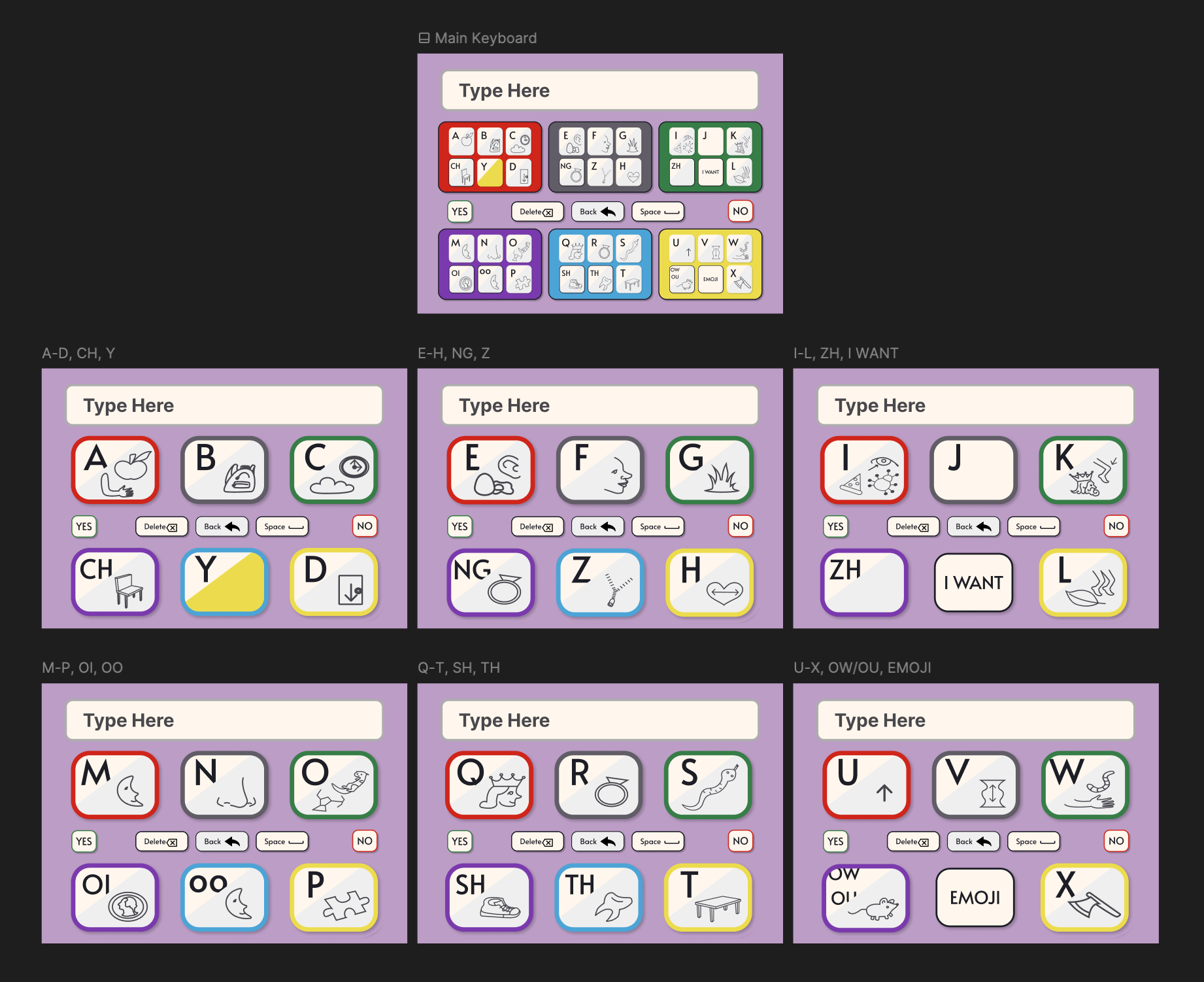
An image of the final UI. There is a main keyboard, and 6 pages of smaller groups of letters. Each key has an icon that matches the letter sound. There is a space, delete, back, yes and no button.

Applying the principles of atomic design by creating atom-level components and variables and using them to create molecules and cards allowed me to apply changes in real time in collaboration with Ellie - all while maintaining consistency at each iteration.

Ellie indicated the following preferences for the key layout: 
1. Alphabet-based organization to help her find the letters where she would expect them to be.
2. Diverse clusters to limit misinterpretation by an eye tracker, predictive text, or a communication partner.
3. Include all english sounds as keys, like "TH," to speed up spelling.

Interaction & User Testing (Week 8 - 12)

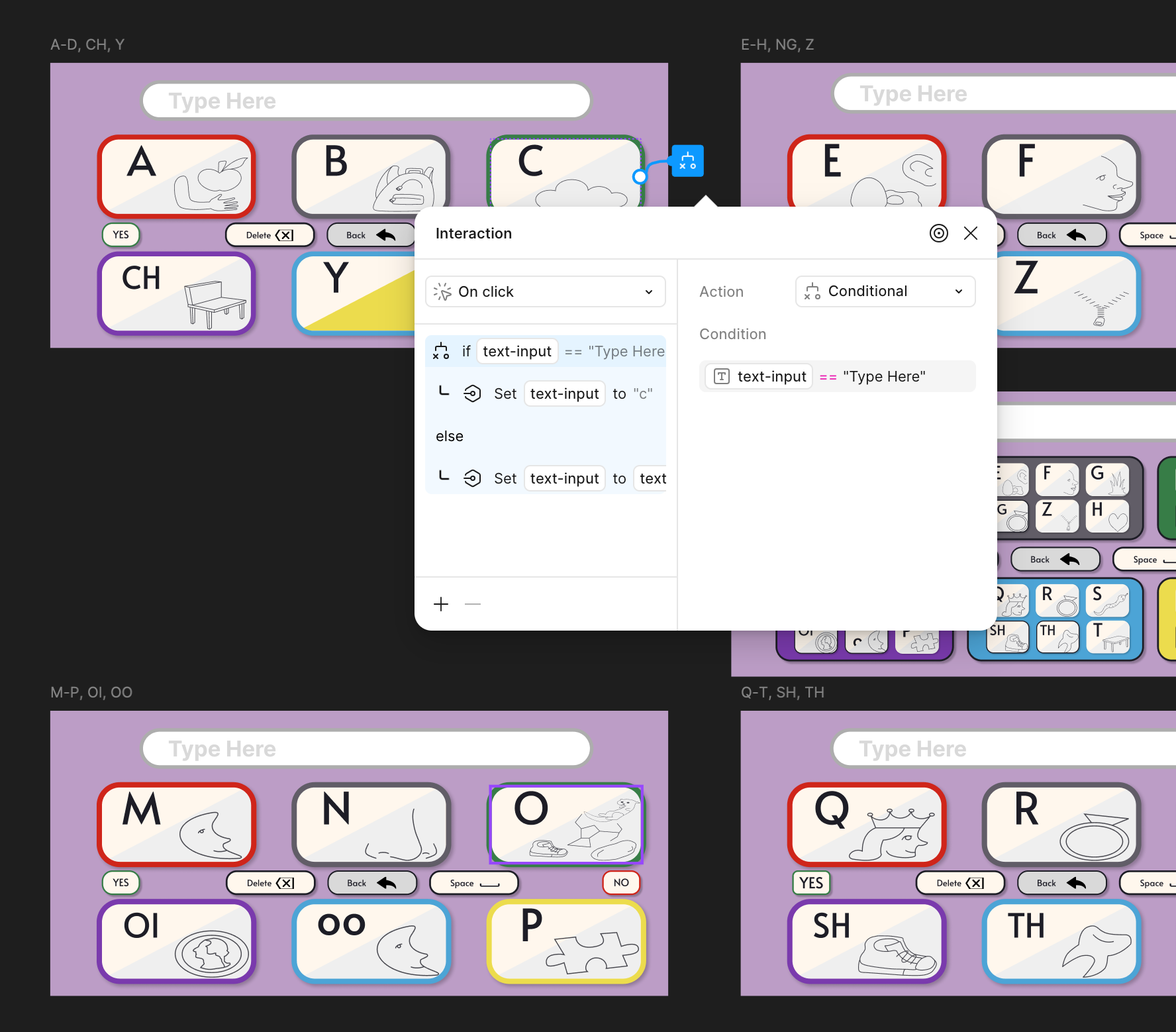
A picture of the keyboard interaction settings on figma

With Ellie's go-ahead (a rating of 5/5, her usual scale for communicating when a product or idea fully meets her expectations), I got to work making the text field interactive enough to test the usability of the design.

She rated the transition from main board to "selected card" view a 5/5, verifying that the reduction in clutter decreased her strain significantly.

Sticker Sheet & Design System

Every button, tile, and card layout, along with their interaction states, used in both the mobile and desktop designs. This sticker sheet makes modifying and personalizing the ComBoard hassle-free, allowing me to continuously provide the student with a tool that best suits her needs as she is able to communicate them to me over time.  

Learnings & Next Steps

I worked with Ellie from 05/2024-06/2025 as her full-time, in-school aide. During that time, she completed over 20 courses ranging from Calculus II and Neuroscience to Liberation Theologies and Art History. Not to mention Poetry and Painting class and her Independent Study course. Throughout her senior year, she used her eye gaze to complete Calc summative assessments, write essays and poems, to create posters and presentations, and to contribute to classroom conversations.

My job was to notice, to listen, and to collaborate with her to translate her thoughts and ideas so that the world could hear them too. We primarily used left/right selections with hand signals to communicate. Multiple times a week I asked her to assess my efficacy as her aide with the following questions on a scale of 1-5: "Did I interpret your ideas correctly?" "How am I doing as your interpreter?" "How well does this sentence represent what you meant to say?"

ComBoard was used to write essays, chat during free time, and answer free response prompts.
The most crucial wins came from:

The most crucial wins were:
1
Seeing her gain confidence with ComBoard, increasing speed and words per session.
2
Being able to hold my phone or her tablet with ComBoard prototype open, without blocking her face, easily and in any location with just one click.  
3
Seeing gains in interpretation accuracy. (Fall of 2024, Ellie rated my interpretation 3/5 and expressed the need for both of us to practice more with the board. By Spring 2025, she rated my interpretation 5/5 and routinely selected ComBoard as her preferred solution.)

Steps to Improving & Furthering the Product

1
The mobile layout needs a redesign to improve use of screen; the button set running horizontally through the screen is cramped and creates an accessibility obstacle for users with low motor control. The text display needs to be re-imaged to support focused spelling of one word at a time while also tracking the full sentence.

Mobile Layout & Text Field

2
The current design is tailored to one individual, but the product has potential to scale for many people with similar mobility limitations. I plan on designing several more "presets" and working with other developers to find the best way to put power in the hands of users to personalize the layout and function to fit their unique needs.

Robust Personalization

3
It is important for me that Ellie continues to have access to this product, so I will be focusing my next steps on publishing this as a website and as a downloadable app for her to continue using independent of my work as her aide.

Dev Collab

4
For this product to move forward, I need to conduct one-on-one interviews with at least 5 additional individuals who use AAC devices to understand their needs and let them guide further design decisions. Later, moderated usability studies will guide the iterative process.

More User Interviews & Usability Study

Budget App
ComBoard
Svetim Logos