Lidia's Logo; a two tone teal "L" shape with an orange arc over the right side create a capital "D" shape.
Lidia Paints
Lidia Paints
Lidia Paints

Lead UX Design (solo)
Figma

Sept 2024 - Jan 2025
Download 1 Pager
Animated preview of the sign-up for a class flow on the desktop site
Desktop Design (click for prototype)
Problem:

An art educator needs a way to market their courses and streamline sign-ups while staying true to their brand and personality and keeping the purpose and user flow clear.

Solution & Goal:

A responsive site that communicates a welcoming and peaceful personality and which implements a flat site structure with consistent top bar navigation to direct the user flow towards course discovery and sign-up. 

An animated preview of the sign up for a class flow on the mobile site.
Mobile Design

Empathy & Research

Empathy & Research

Empathy & Research

Methods:
Client Interview

Key insights

Client wants their site to be inviting, warm, and encouraging.

Design decision:
Select a harmonious color palette favoring pastels and avoiding high saturation or visually heavy hues; allow substantial negative space to minimize mental load.
Client doesn't have a logo, and would like a custom design that fits seamlessly into the site and for it to incorporate her initials or name to aid in recognition.

Design decision:
Use roundness to convey friendliness and approachability; incorporate brush texture to signal artist identity.
Client has a lot of courses to offer, and wants to make sure the site does not get cluttered and stays easy to navigate.

Design decision:
Use interaction design to create engagement with the site; minimize clutter by revealing course descriptions on hover or focus state of course cards.
Journey Map
Ellie is frustrated and exhausted by current communication methods that further create distance between her and her aspirations. She wants to communicate independently and in real time.

Problem Definition & Success Metrics

How might we…design an AAC app that minimizes set-up and eye strain, integrates AI for predictive text and smart gaze tracking, and adapts to the unique needs of the individual so that they can communicate efficiently and independently without obscuring their face?

Quantitative Goal: Double instances of spelling to communicate from 2x/month (spring 2024) to 4x/month (spring 2025)

Results: 980% increase in spelling instances using ComBoard 5x/week by spring 2025 on aide's phone and student's school tablet compared to 2x/month spelling instances when relying on heavy, bulky, plexiglass board.  


Qualitative Goal:
User preference rating at least 20% higher than other methods.


Results: Method preferences were scored by the user Tobii (1/5), Plexiglass board (3/5), ComBoard (5/5)

Design Process

Design Process

Design Process

Mobile App Design

A circular logo with a pink horizontal brush swath and a large L and P in green in the center. The logo says lidia paints and has a small floral detail.A wallpaper design with a white background and a swirling heart made out of a soft pink brush texture

Building the Brand (Week 1)

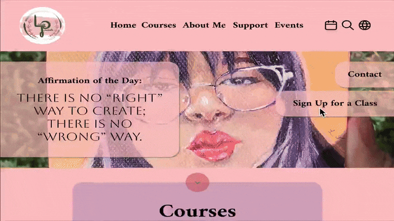
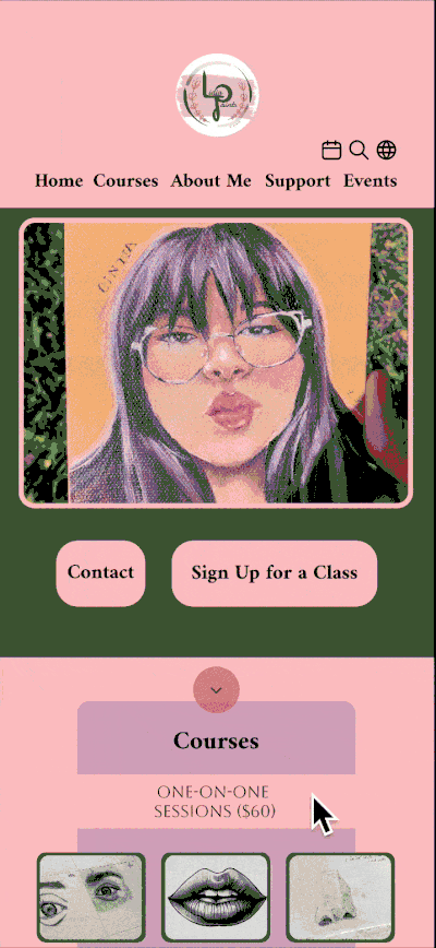
Warm, pastel pink satisfies the clients brand identity as an inviting and encouraging art educator while earthy green creates balance as a secondary color for the site, drawing attention to CTA's and other visual elements.

The logo plays on the client's initials, L.J.O., but combines the J and O into a P to tie in her business identity "Lidia Paints." The client loved that she could use this as an identifiable signature for her artwork as well, unifying her art pursuits.

A round design and brush textures emphasize expressiveness over rigidity -- overcoming a stereotype often associated with professional artists and teachers.

A photo of the paper wireframe for the first few screens of the sign up flow

Paper Wireframes & Main Flow (Day 6)

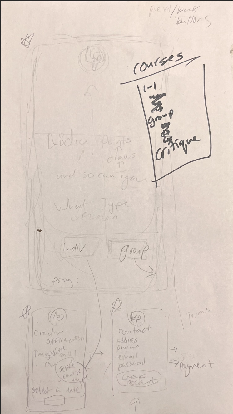
The client wanted to avoid boring forms in the course sign-up and checkout flow, so I sketched up an idea for building her form into an "affirmation" so that users can associate their sign up with a desired outcome.

The client loved the idea of collecting name and sign up information by having users fill in the blanks to their own affirmative statement.
"I'm ______ and I can ____."

A photo of the paper wireframe for the first few screens of the sign up flow

Comparative UX Audit (Week 2)

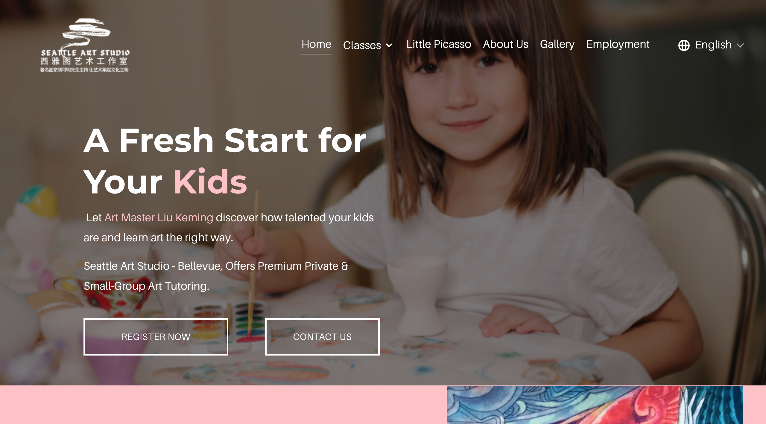
I audited 5 existing art course pages. Seattle Art Studio stood out for its simplicity and ease of navigation, so I adopted a similar layout.

One issue I found in their page is that course information is hidden behind clicks, creating some friction when browsing. In my design, you can learn about each course right from the landing page by hovering over each course card.

A photo of the paper wireframe for the first few screens of the sign up flow

Interaction (Week 3-10)

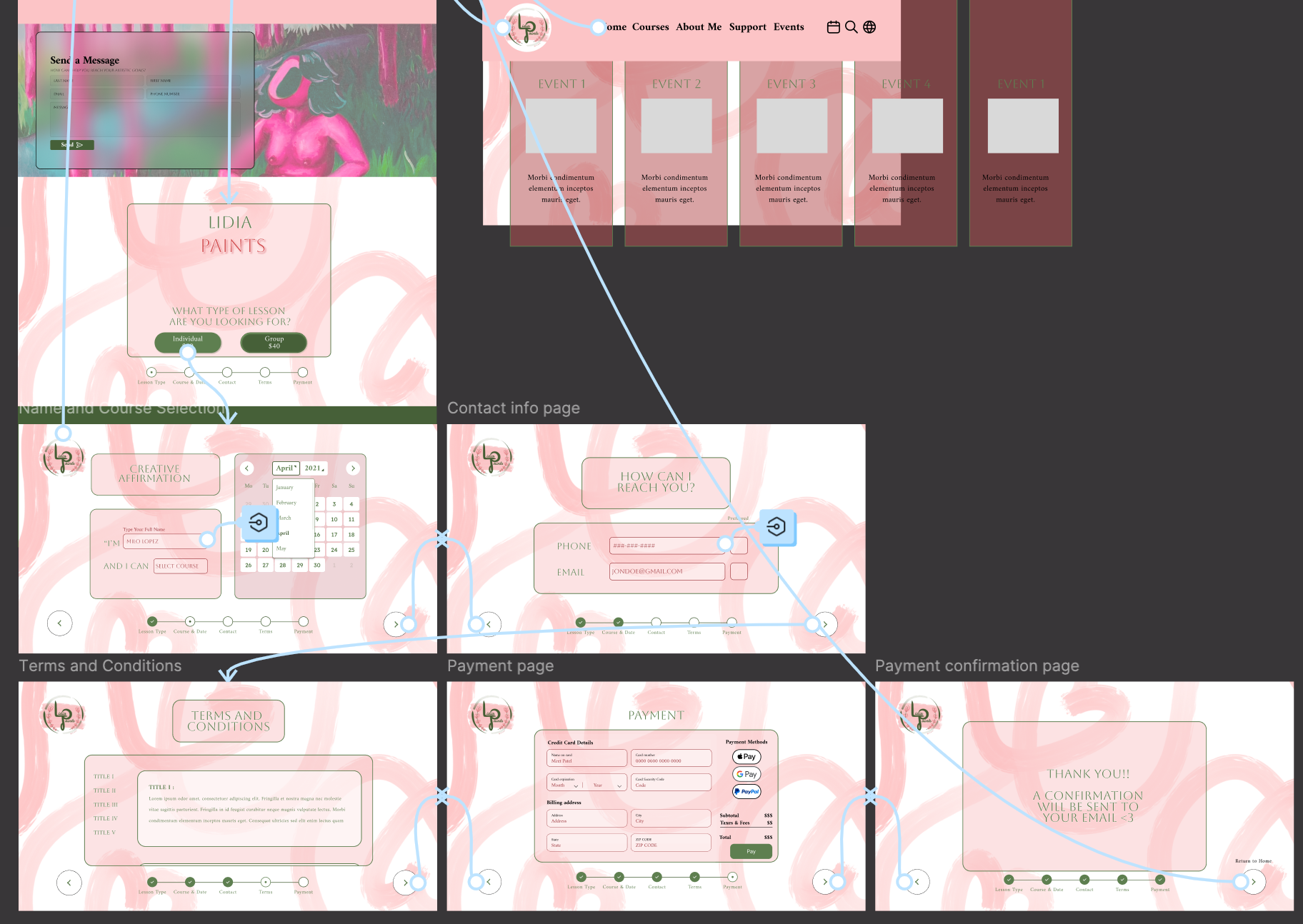
The client wanted lots of creative details on each screen. I worked with her to create an animation, carousels, and to personalize the calendar, input fields, and legal page to fit her brand.

Sticker Sheet

Sticker Sheet

Sticker Sheet

Many of the course thumbnails are examples of the client's artwork or that of her students, while the rest of them are AI generated placeholders.

Eventually, the client will collect photos from each of the courses to replace the thumbnails. I will be able to quickly make the swap on my component page and make the update without disturbing the rest of the design.

Sticker Sheet

Sticker Sheet

Sticker Sheet

Many of the course thumbnails are examples of the client's artwork or that of her students, while the rest of them are AI generated placeholders.

Eventually, the client will collect photos from each of the courses to replace the thumbnails. I will be able to quickly make the swap on my component page and make the update without disturbing the rest of the design.

Learnings

Learnings

Learnings

Translating the client's vision and personality into a design that she was pleased with.
Striking a balance between practicality and creativity such that users can still easily navigate the page while representing the client's personality.
Learning about the usefulness of component states and variables and finding resources in the Figma community library to speed up the design process.

This project allowed me to explore what is possible on Figma, but I had not yet learned about column layouts, grids, or accessibility requirements. There are many areas of improvement for this page to meet industry standards and meet the needs of my client and her user base.

Next Steps

Next Steps

Next Steps

Omit flowers; choose one line type for the green circle; improve typography for a more consistent, replicable, and recognizable style.

Logo Design

Implement a single column layout; swap the tab bar for a hamburger menu; use a smaller logo placed in the left corner of the screen.  

Mobile Layout

The client has not finalized the course descriptions and the legal copy. Once this gets sent over, I will be able to swap out the filler text and make any necessary adjustments.  

Finalized Copy

Choose more readable typeface, like Inter; clarify hierarchy to improve scan-ability and screen-reader use. WCAG audits are needed to ensure color contrast compliance.

Text Hierarchy & Accessibility

Budget App
ComBoard
Svetim Logos