View all 1-Pagers
About Me
Email Lidia
Resume
Budget App
Budget App
ComBoard
ComBoard
Lidia Paints Site
Lidia Paints Site
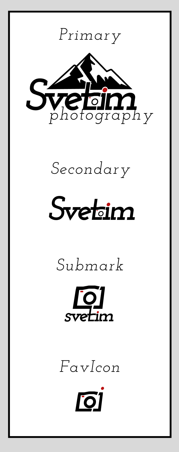
Svetim Logos
Svetim Logos

Key Research Insights
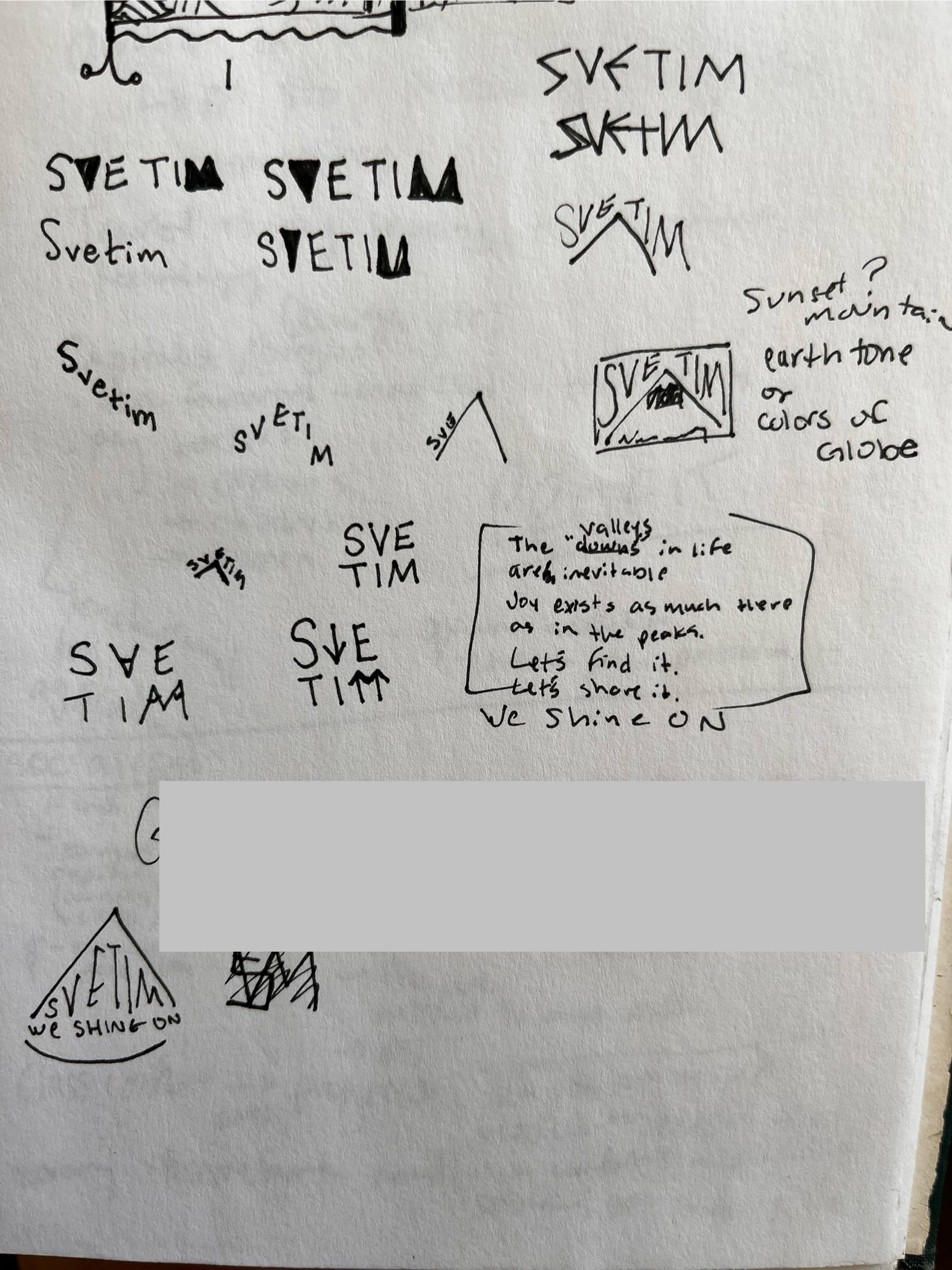
My first approach was to sculpt the text around a simplified mountain motif.
Svetim = "we shine on" in Russian, a concept central to Svetim's creative pursuits. To tie this into their logo, I explored the use of sunrise colors and including "we shine on" directly within the logo.
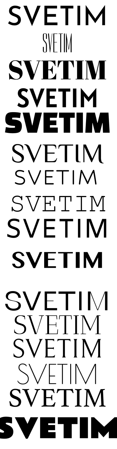
I collected several professional, simple, and legible types with some small creative touch.
I tested various combinations of letter spacing, boldness, serifs, and blunt/pointy-ness to achieve the "rugged but playful" Svetim brand.
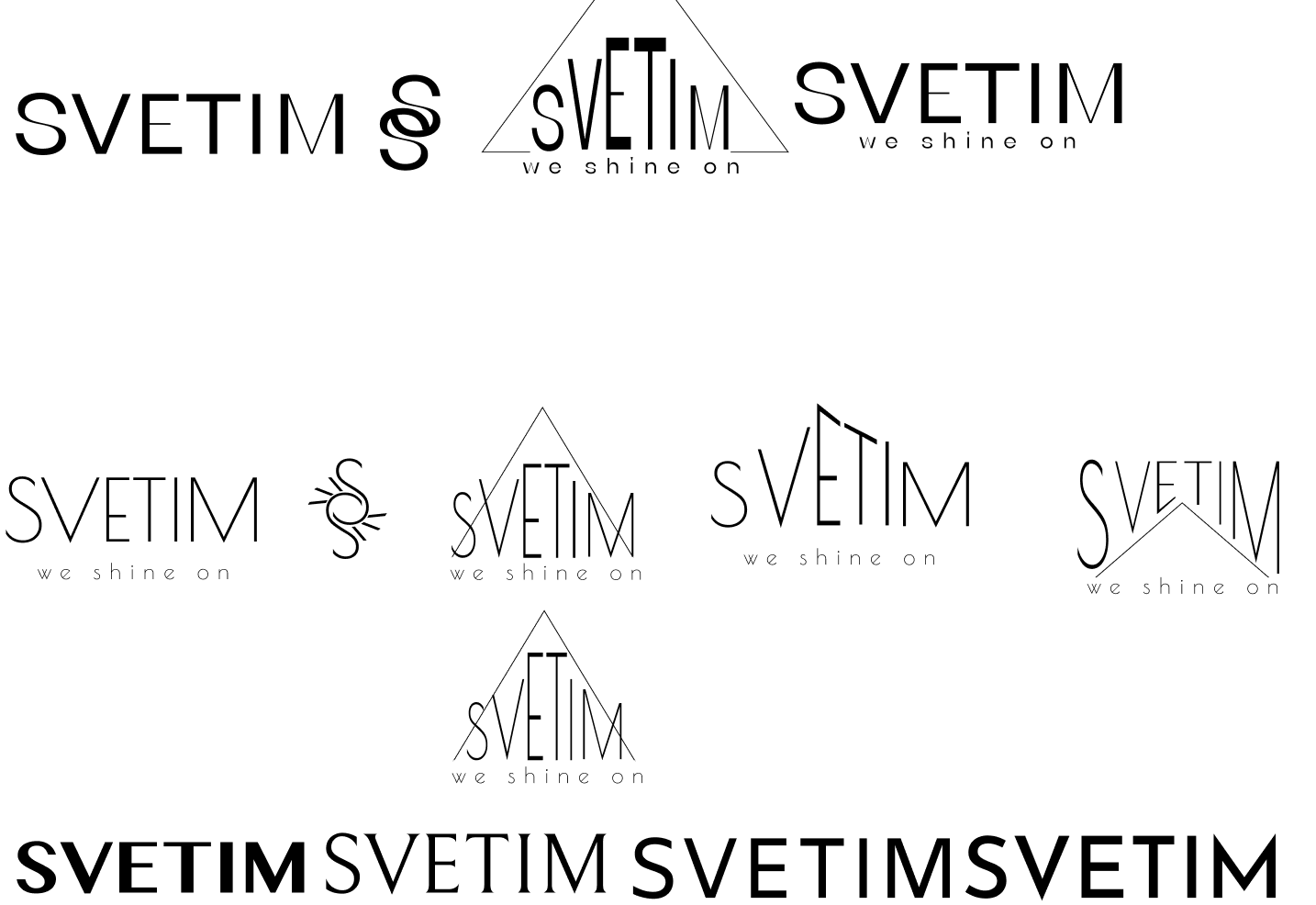
These were the rough drafts I brought to our second meeting, where he told me they all gave him the impression of a real estate brand.
Main meeting takeaways:
Back to the drawing board, I found Josefin Slab's bold italic with -5% letter spacing yielded the right balance of playfulness and ruggedness.
Bold letters, thick and sparingly used serifs --> grounded and weighty without being stern or overpowering
Customized "t" and "i" take advantage of the gestalt principle of closure to create the illusion of a camera
This was a lot of fun to work on! I approached the design task like a puzzle, and tried to find the best design pieces to coalesce into the picture the client was hoping to see at the end.