Svetim Logo Suite
EmailEmail LidiaLidia's Resume Lidia's Resume Resume
Download 1 Pager

Svetim Intro

Overview

Empathy & Research

Problem Definition & Success Metrics

Design Process

Sticker Sheet

Learnings & Next Steps

Improving & Furthering Project

Svetim: Design a logo for a photographer/streamer to use across all platforms.

(5 weeks)
Lead Graphic Design (solo)
Download 1 Pager
Svetim is written with bold, serifed font. The t and i create a camera icon in between them and the dot of the eye is red.
Secondary Logo

Overview

Problem:
A photographer/streamer wants a logo that can be used across his photography and streaming content. Although he does not have any specific requests for the design, he used the words "rugged" and "playful" in his initial descriptions.

Goal:
Design four logo variants that can serve as watermarks, merch designs, signage, and social media posts or profile images.

Solution:
A minimalist logo suite with just enough flair to hint at a playful personality while maintaining professionalism and brand recognition.  

Note about constraints:
Work for this project was done part time, after work hours and on weekends.

The svetim camera icon is a minimalist black shape with a circle inside for the lens. It has a red dot above its top right corner.
Submark

Empathy & Research

Methods
Client interview

Key insights

1
Client wants their logo to be rugged, playful, and clearly indicate what they are about.

Design decision:
Incorporate camera iconography to point to photography and streaming. Use a typeface that prioritizes legibility without being too clean-cut or simple. Possibly include mountainous motifs for the "rugged, explorative, and curious" personality.  
2
Client potentially wants their logo to include their name, Svetim.

Design decision:
I advised them to keep the name in the logo to boost brand recognition and cohesion across platforms where they are already using that name. I suggested we could pivot the design direction after the first drafts if they are dissatisfied with the text-forward look.
3
Client wants their logo to be minimal but not basic, otherwise is unsure of their desired design direction.

Design decision:
We agreed to meet again at the end of two weeks to discuss rough drafts and clarify direction.
Journey Map
Ellie is frustrated and exhausted by current communication methods that further create distance between her and her aspirations. She wants to communicate independently and in real time.

Problem Definition & Success Metrics

How might we…design an AAC app that minimizes set-up and eye strain, integrates AI for predictive text and smart gaze tracking, and adapts to the unique needs of the individual so that they can communicate efficiently and independently without obscuring their face?

Quantitative Goal: Double instances of spelling to communicate from 2x/month (spring 2024) to 4x/month (spring 2025)

Results: 980% increase in spelling instances using ComBoard 5x/week by spring 2025 on aide's phone and student's school tablet compared to 2x/month spelling instances when relying on heavy, bulky, plexiglass board.  


Qualitative Goal:
User preference rating at least 20% higher than other methods.


Results: Method preferences were scored by the user Tobii (1/5), Plexiglass board (3/5), ComBoard (5/5)

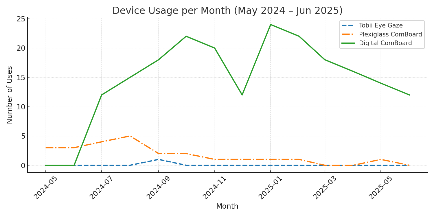
Based on observational data. Mid-summer 2024, the student began consistently choosing to use the digital ComBoard over the plexiglass. Once school started, this became the exclusive choice for spelling tasks in school, but it is my understanding that the plexiglass solution was still used at home.

Design Process

Mobile App Design

Sketching (Week 1)

Brain dump of ideas sketched in pen on paper

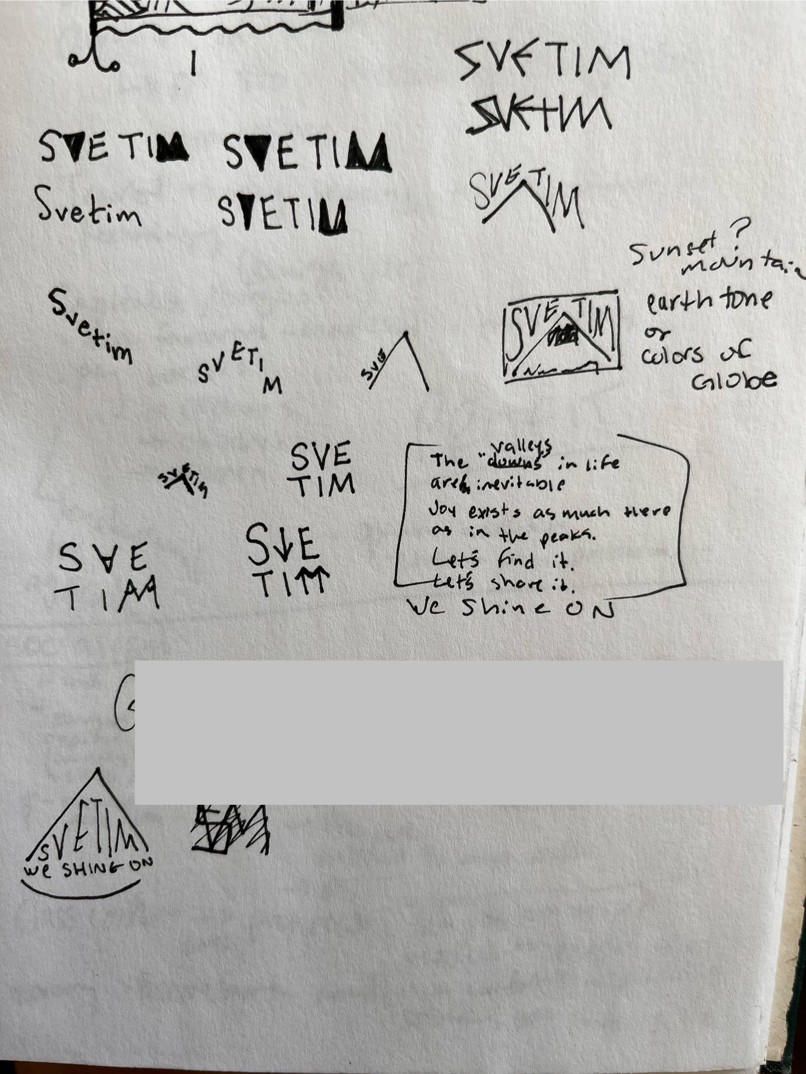
My first approach was to sculpt the text around a simplified mountain motif.

Svetim = "we shine on" in Russian, a concept central to Svetim's creative pursuits. To tie this into their logo, I explored the use of sunrise colors and including "we shine on" directly within the logo.

Type Exploration (Week 2)

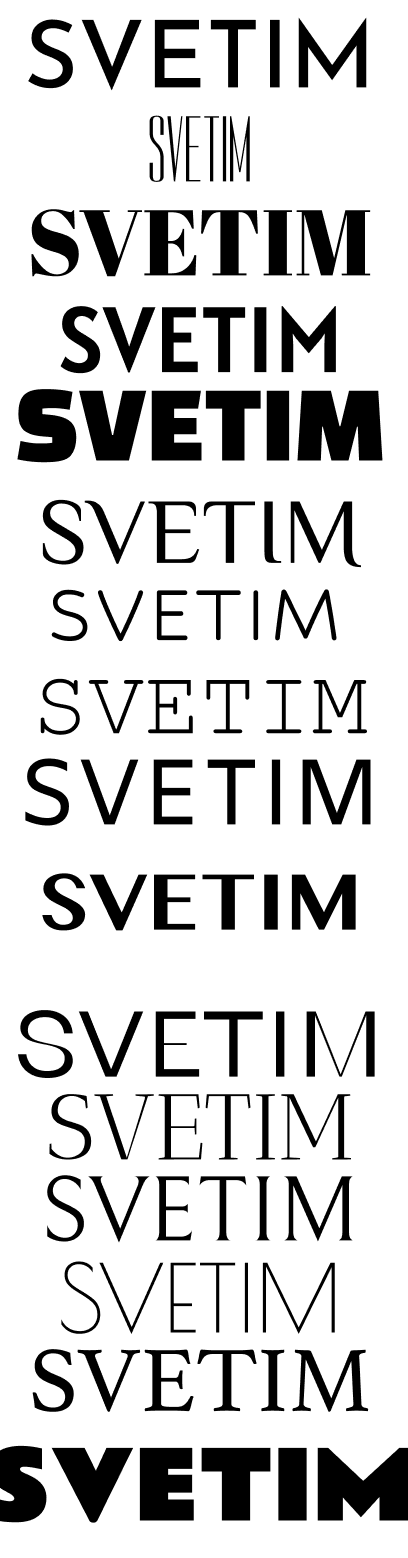
I collected several professional, simple, and legible types with some small creative touch.

I tested various combinations of letter spacing, boldness, serifs, and blunt/pointy-ness to achieve the "rugged but playful" Svetim brand.

A picture of 16 fonts considered for the logo

Client Check-In (Week 3)

A set of possible design sketches in figma using sans serifed fonts and triangular shapes. "we shine on" is suggested for a subheading under the primary logo.

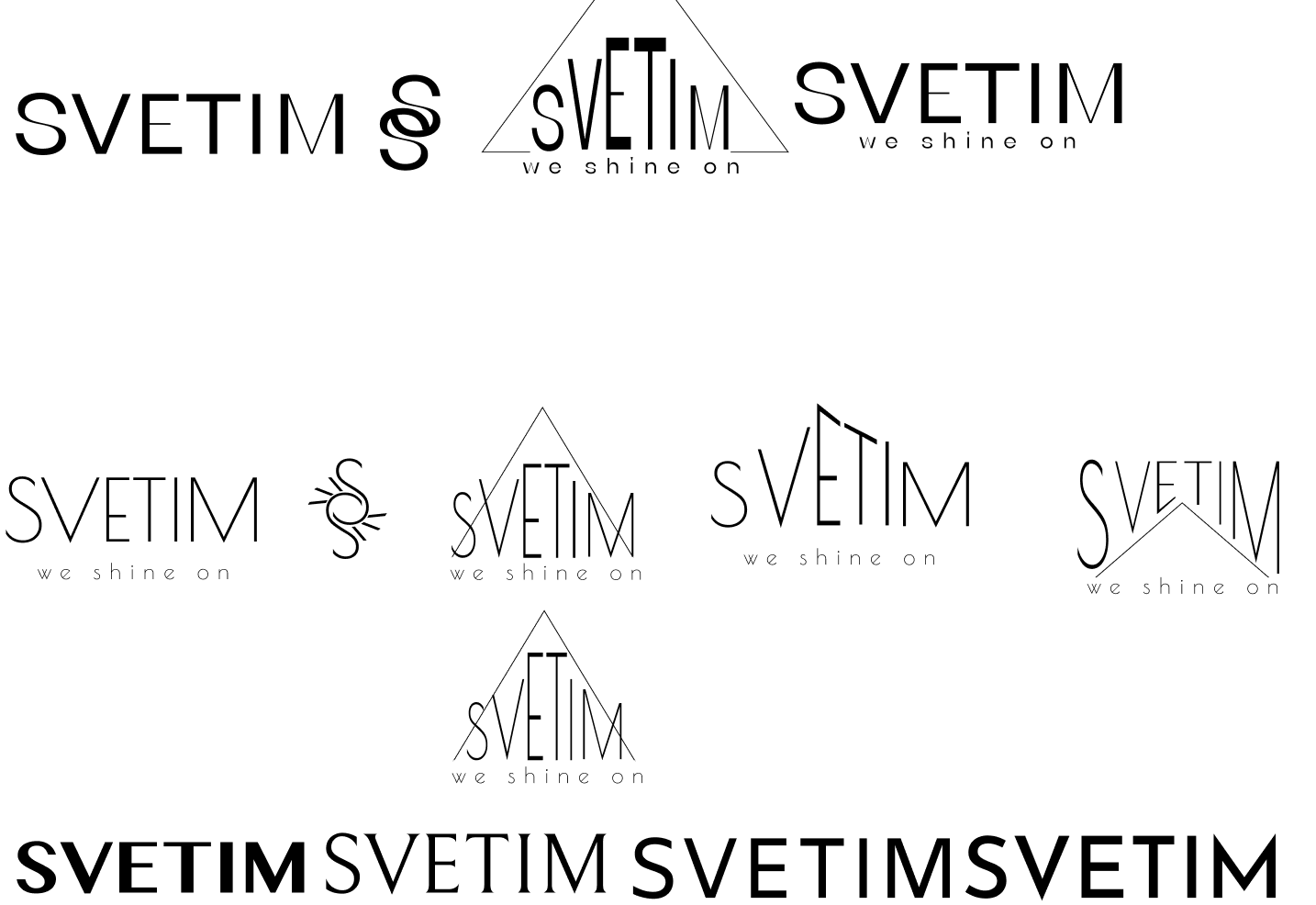
These were the rough drafts I brought to our second meeting, where he told me they all gave him the impression of a real estate brand.

Main meeting takeaways:
1. Letters same height > stretched/compressed
2. Bolder > fine
3. SS symbol did not work for the client
4. Client wants to avoid overly triangular look
5. Black only > colored logo
6. No subheading

Refining & Variations (Week 4-5)

A picture of the finalized logo suite including a primary logo with a mountain motif over the word svetim, a secondary logo that says Svetim, a submark that is the camera icon and the word svetim, and a favicon that is just the camera icon.

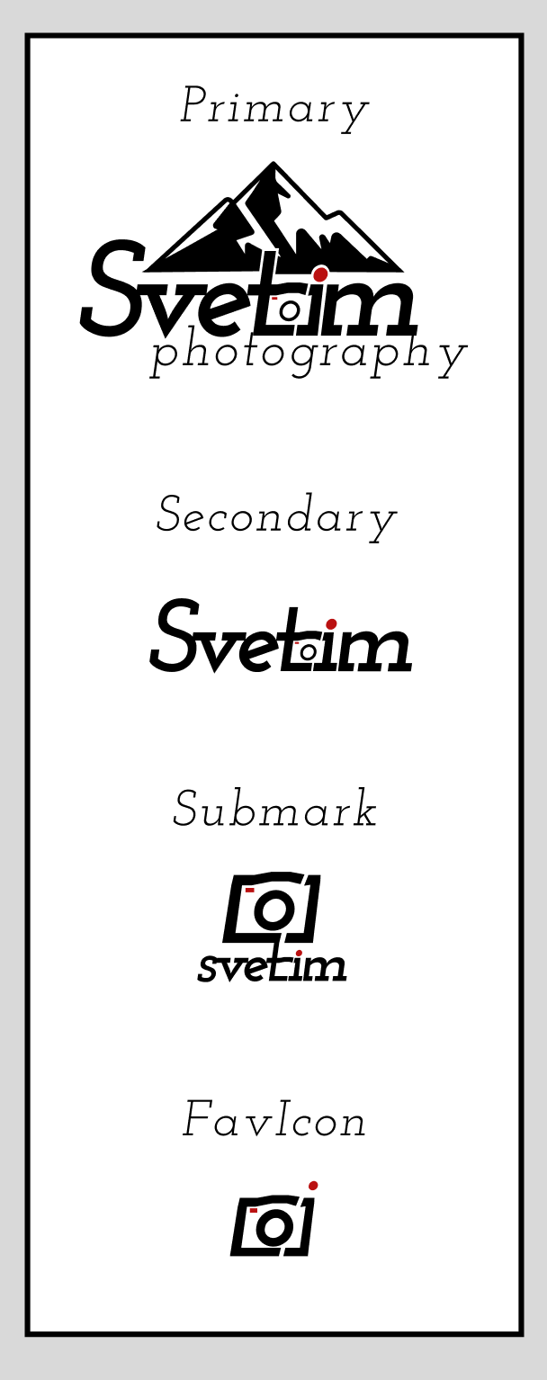
Back to the drawing board, I found Josefin Slab's bold italic with -5% letter spacing yielded the right balance of playfulness and ruggedness.

The bold letters with thick, sparingly used serifs feel grounded and weighty without being stern or overpowering.

The slanted "e" with a short tail is playful without being unserious.

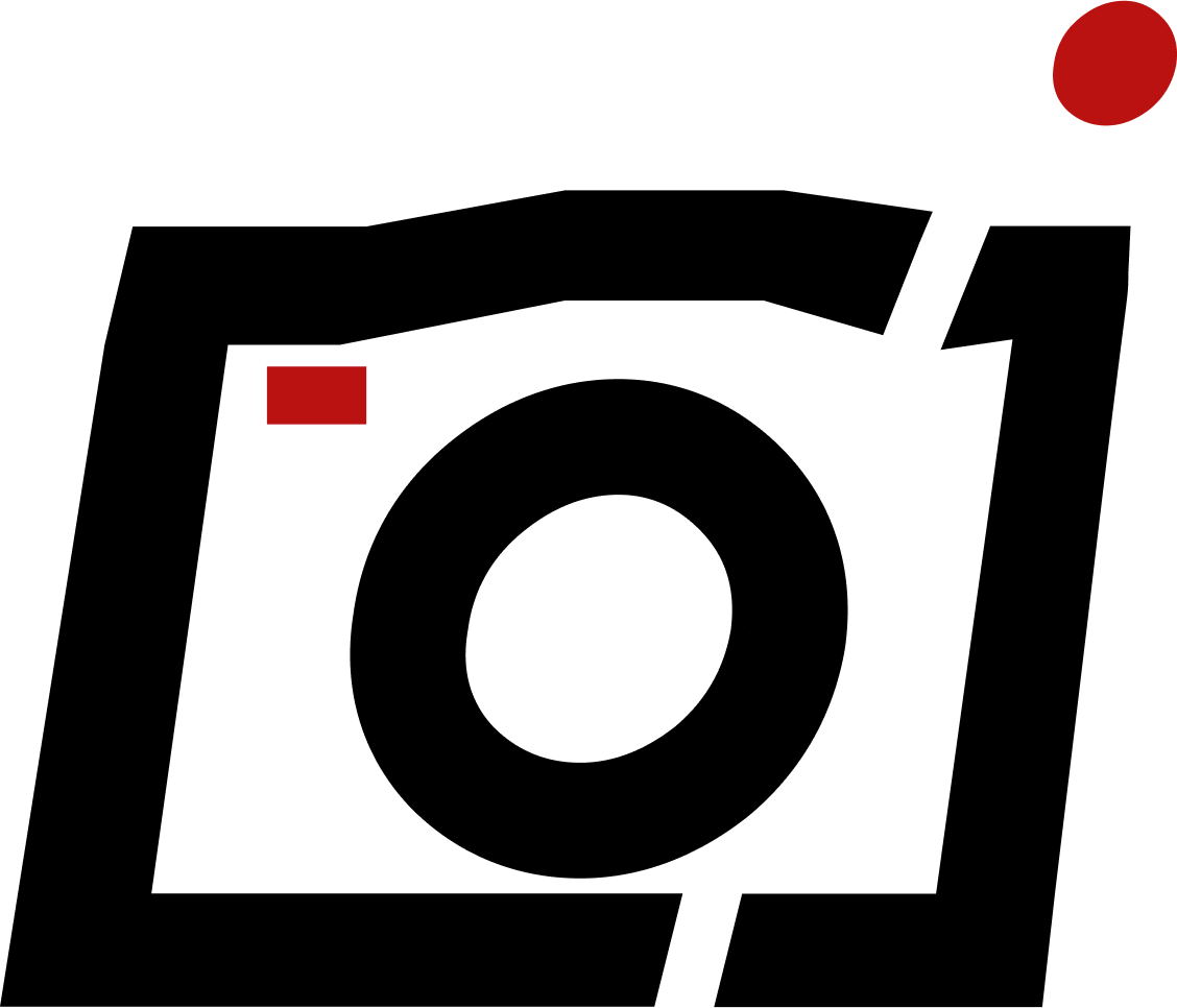
I customized the "t" and "i" to take advantage of the gestalt principle of closure and create the illusion of a camera.

Finally, I drew even more attention to the camera motif with a touch of "recording-video-red."

Once Svetim approved the design, I emailed the logo suite folder containing each variation in black, white, and 4 sizes from Small to X-Large to suit every use case.

Sticker Sheet & Design System

Many of the course thumbnails are examples of the client's artwork or that of her students, while the rest of them are AI generated placeholders. Eventually, the client will collect photos from each of the courses to replace the thumbnails. I will be able to quickly make the swap on my component page and make the update without disturbing the rest of the design.

Learnings & Next Steps

This was a lot of fun to work on! I approached the design task like a puzzle, and tried to find the best design pieces to coalesce into the picture the client was hoping to see at the end. Here are some wins and things I learned along the way:

1
Sometimes it is easier to communicate from a negative comparison. My client was able to tell me "I definitely do not want triangles, I don't want to be confused for a real estate company!" after seeing what that might look like, but they weren't able to tell me this beforehand.
2
The client was very happy with the delivery of the logo suite folder with all of the size variations! They are able to quickly grab what they need to keep their file sizes and load times optimized.
3
Small details go a long way! I did not need to paint a whole sunrise to make the logo dynamic; a simple red dot, well placed, is enough to draw attention and communicate meaning.

Growth Areas

1
At the outset, I did not know what I was looking for or how a typeface could be used to communicate brand identity. It took some trial and error to find a good match, but with some more study and practice I want font-selection to become second nature.

Font Psychology

2
I think I could have done more to help the client share about their brand and what they want the logo to communicate and do for their brand. I want to seek out resources for acquiring more effective client interview skills to improve my ability to design to delight any client.

Client Interviewing

3
I missed out on the opportunity to do an audit of related brands or individuals and their logos to get inspiration for both myself and my client. In future projects, I plan to prepare a folder of related existing logos in advance to aid in clarifying the design direction. 

Comparative Audits

Budget App
ComBoard
Svetim Logos